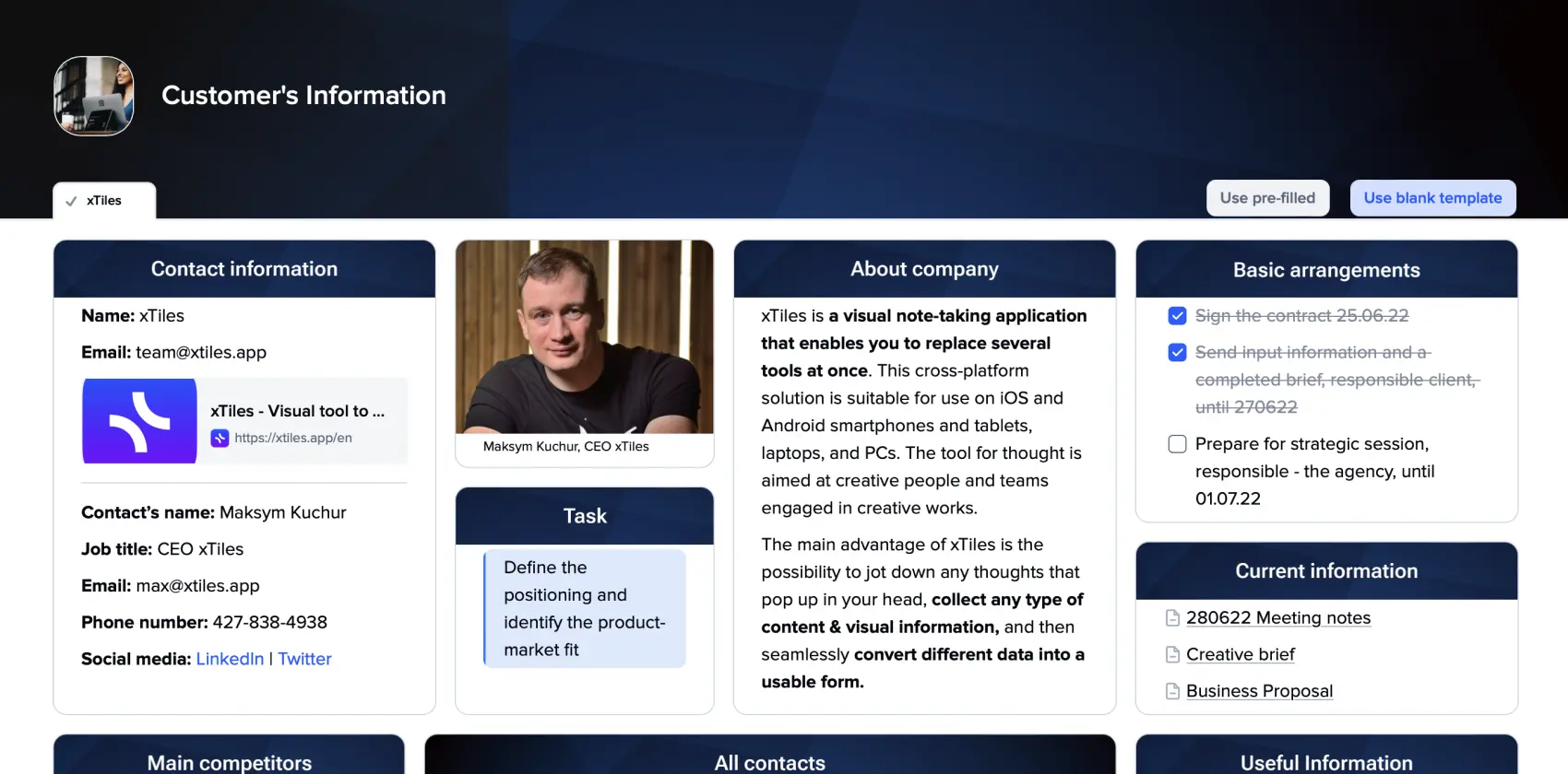
Customer Information
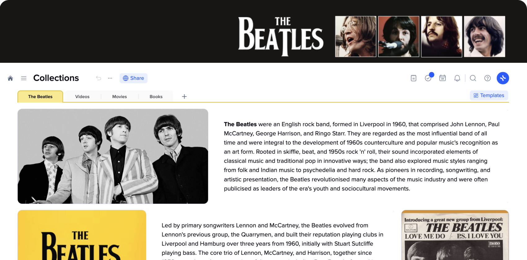
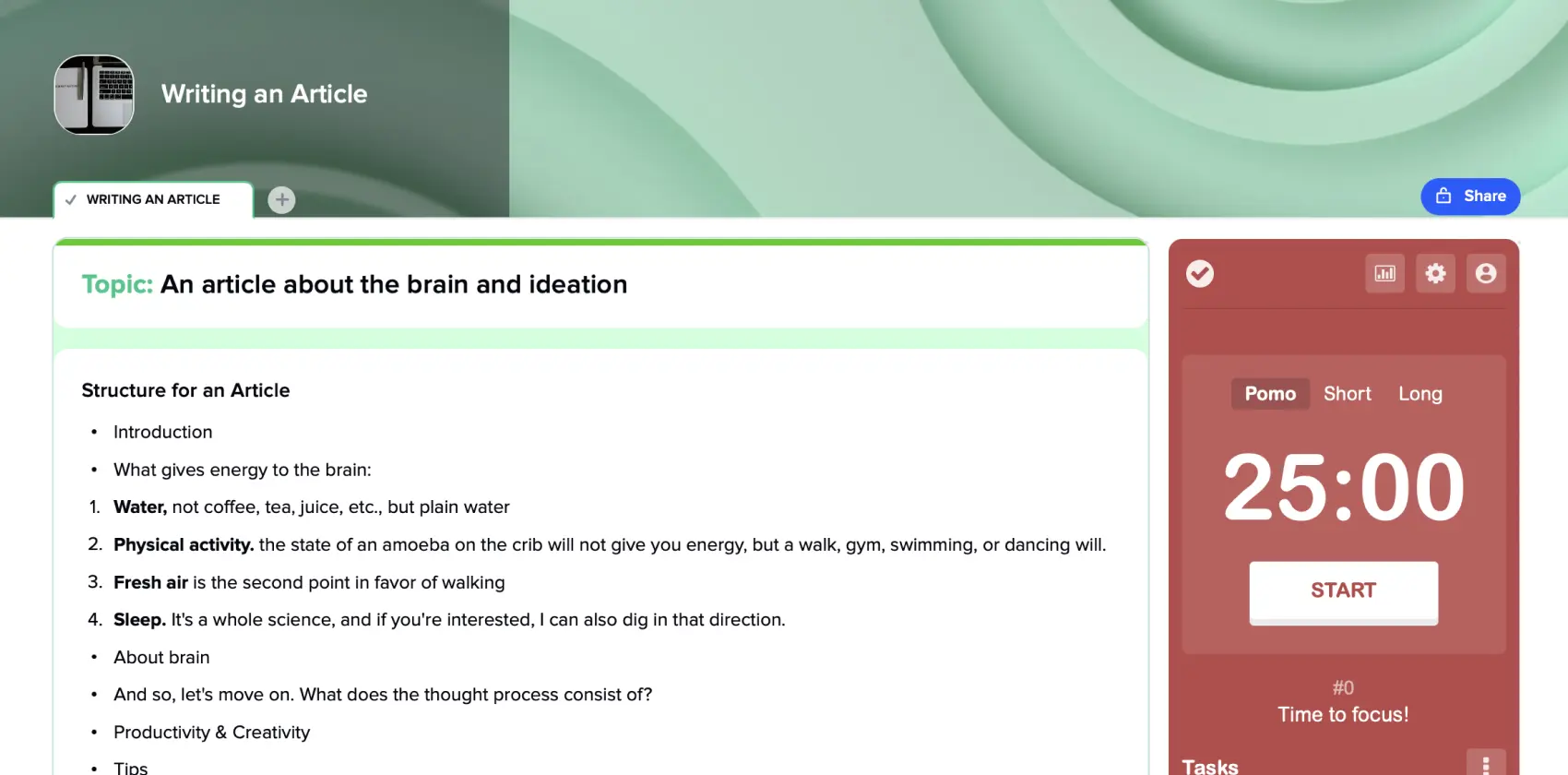
Writing an Article
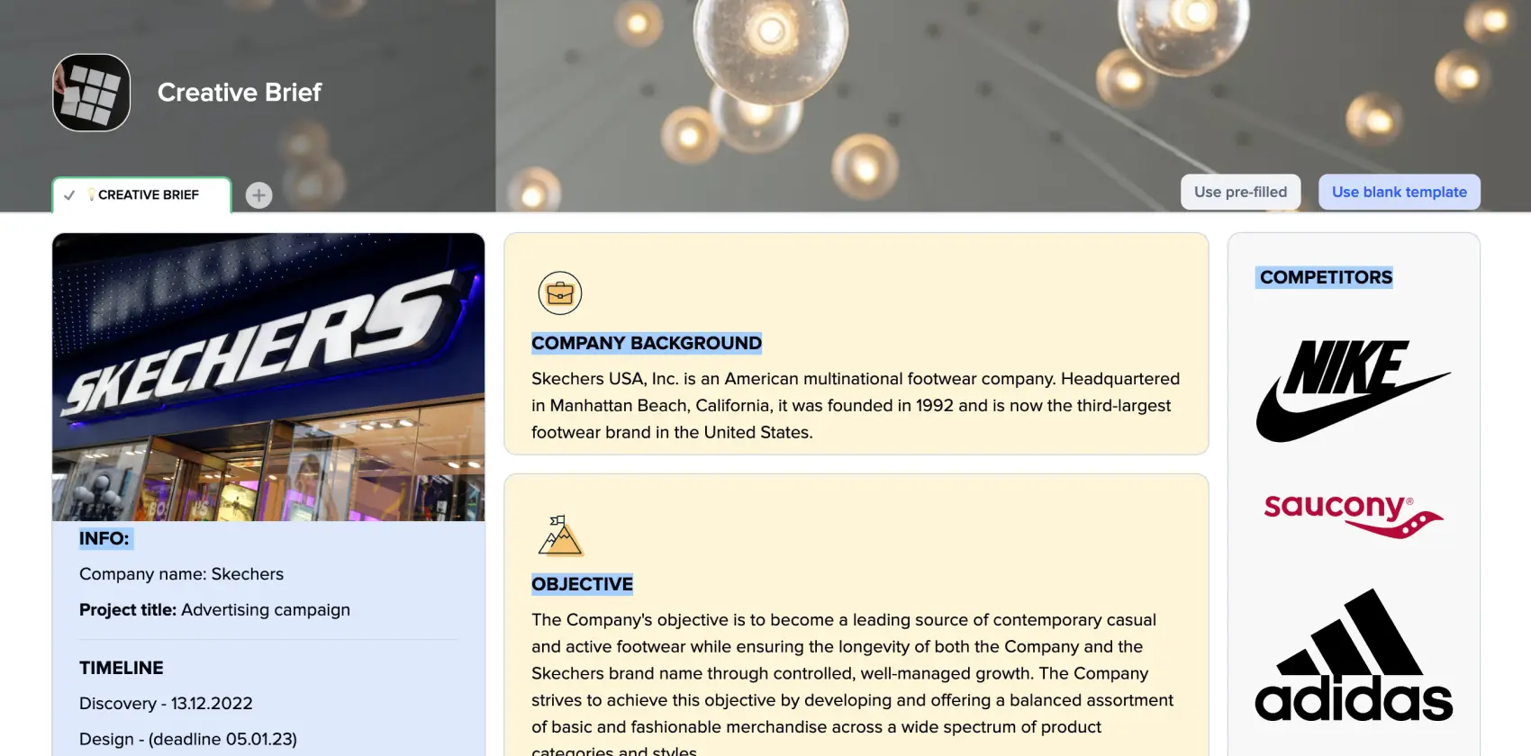
Creative Brief
Cornell Notes
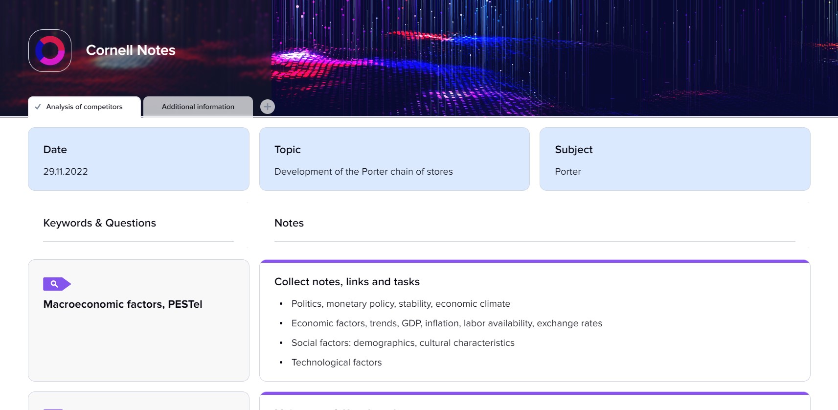
Cornell Notes
This free Cornell Notes template is suitable for all students. It lets you review lectures, take notes, and capture screenshots, thoughts, and questions in one document.
What are Cornell Notes?
This is a system invented by Walter Pauk, an education professor at Cornell University in the 1950s, for taking notes in an organized way with their further easy reviewing and consideration.
Besides the fact that your success depends on many factors, like your determination, how hard you work, etc., there are small tools that support you during your journey. Cornell Notes system is one of them. Tested over the years by millions of students, it remains one of the best templates for easy note-taking.
It is generally believed that this note-taking method is for high school students and college level. However, everyone is free to use it, whether they are a student or not. Our entire life is about studying, so having a reliable supplementary tool may seriously ease the process. A great variety of free templates for Cornell note-taking, including Cornell Notes templates for Microsoft Word, Google Docs, and Pages, may help a wide circle of people discover this method and apply it to their advantage.
Since the method was developed a couple of decades ago, it has evolved a bit, and now there are different versions. Today, we even have field-specified ones. For example, Cornell Notes templates for math are quite popular. However, the classical one is still unbeatable due to its versatility.
So, what does a traditional Cornell note look like? A notetaker creates three sections: two columns (one will contain general data you’re taking down, and the other is for asking questions) and a summary at the bottom. This way, you have distilled information on the subject.
Why is the Cornell Notes Template so effective?
Do you use one method for making records from different spheres of your life? People whose answer is “Yes,” usually apply a pretty chaotic approach to writing down everything important and leaving it to later consideration. This basic-level idea of note-taking is about disadvantages mainly because it steals time, the most precious asset people possess.
If your compendium is only a couple of days old, then you probably are perfectly capable of finding needed pieces of information. However, if they were taken months ago, reading them is quite a riddle.
The advantages this note-taking system can bring into your study routine don’t end with the possibility of finding everything easily.
-
They help people process all the information they get during lectures, allowing them to write only the most important things.
-
They save you time when you’re preparing for an exam.
-
They help track hard questions and everything that requires additional study or research.
-
They allow you to concentrate more on the subject and not on the process of taking notes.
-
Another great bonus is that the consistent use of this method has been proven to strengthen studying skills and memory.
Why are Cornell Notes online templates better?
What is the main disadvantage of a paper notebook? It gives you only one try. Then, it turns into a mess with all the corrections and crossings. If you’re attending many courses, you may need a separate notebook. Can you imagine a bag of what size you must carry with separate notebooks or folders?
However, there’s more. Have you ever noticed how tempting it is to start doodling when the lecture is boring, or it’s just hard to concentrate? Next time you take a look at your notes, it’s full of funny drawings combined with single pieces of information.
What else can damage your notes? Food, liquids, ink strains, etc. However, notes with strains are not that big of a deal. You still have them and can still get something useful out of them. To lose them would be real trouble.
An xTiles Cornell notes template saves you from these threats. You can’t miss anything, but you can freely share (if you want, of course) your notes with your fellow students. No food, no drinks, and no ink can harm your notes now (even if something mentioned previously damaged your laptop, the notes are still perfectly safe).
After some time, your notes turn into your personal knowledge base. All years of lectures are gathered in one place with easy access and the possibility to find the needed information using the search command.
How to use Cornell notes
The Cornell method for note-taking is basically a system for organizing information. So, there would be certain steps with a strictly defined sequence. We will look at the traditional method, the one where you need a notebook and a pen, since it’s the hardest. If you use a template, this preparation phase is already done.
First, you need to divide the page into 3 or 4 parts. You need one small area at the top. There, you will put the date, subject, and topic. Please don’t neglect titles. They help you easily find the needed notes. If you use the xTiles template for Cornell Notes, choose the cover for your notes to make them easier to distinguish from your other records.
Then, you need a bigger area at the bottom of the page. That’s a place for a summary of your lecture. And you need two columns between these two sections. The one on the right side should be approximately twice as big as the left one.
The bigger column is for your notes. Write down everything using telegraphic sentences so that you can keep up with the lecture. You may also use symbols and abbreviations to record the general idea.
It’s worth remembering that when taking your notes, it’s important to retain only the most essential ideas and key points in the cue/recall column to aid memory and review.
Even though the Cornell note-taking system was created to organize people’s notes, sometimes you need to go over them once more to keep everything tidy. So, once the lecture is over, edit your notes before you forget what you could have meant.
The time of the left column comes when you return to your records to study. Review everything you put in the right column, summarize it into keywords, and define the main ideas. Then, write them down in the left column. You may need to highlight or underline the needed pieces to see the full picture and its main components. Some even go further and cross out those pieces that seem insignificant.
The left column is also for questions that arise during the lecture, but there’s no time to ask them or look for the answer. Write them down and clarify everything later.
FAQ
How do you do Cornell Notes?
Divide a sheet of paper into two columns, with a narrow column on the left and a wider column on the right. The left column is used for cues or questions, and the right column is used for note-taking.
What are the 5 parts of Cornell Notes?
The 5 parts are the heading, the notes section, the cue column, the summary, and the page number.
What is Cornell Notes?
This is a note-taking system created by Walter Pauk, an education professor at Cornell University. It is designed to help students organize their notes and review them effectively.
What is the Cornell method of note-taking?
This method is a system of note-taking that involves dividing a sheet of paper into two columns and using the left column to write cues or questions and the right column to write notes. It also includes a summary section at the bottom of the page.
How to do the Cornell note-taking method?
To use the Cornell note-taking method, divide your paper into two columns, with the left column smaller than the right. Use the left column to write cues or questions and the right column to write notes. At the bottom of the page, write a summary of the main points.
What does “cue” mean in Cornell Notes?
“Cue” refers to a word or phrase that represents a question or prompt that helps the note-taker remember the information in the notes. The cue column is where these cues or questions are written.
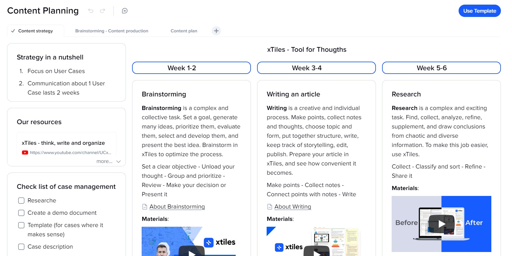
Content Planning
Consulting Project
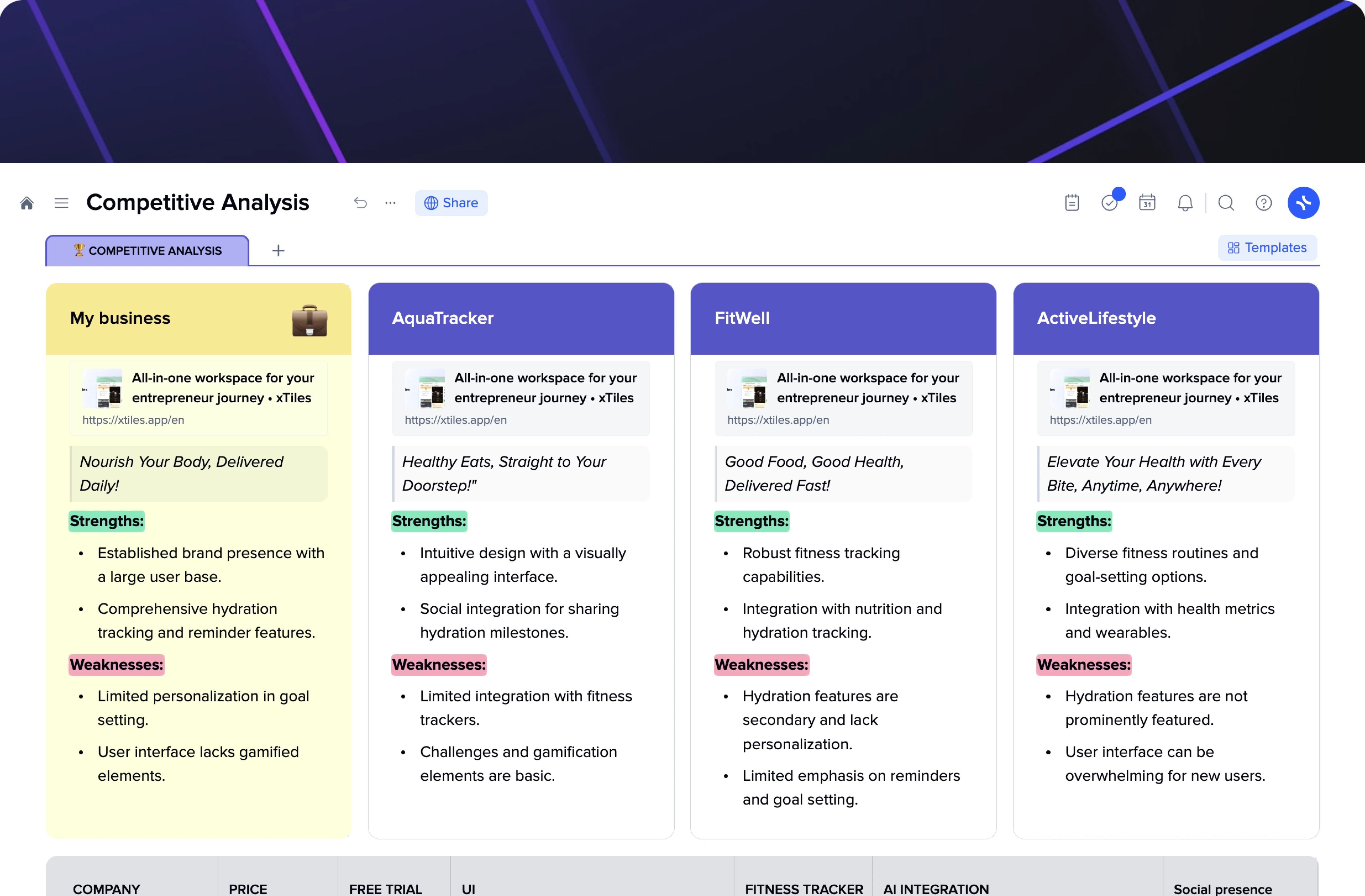
Competitive Analysis
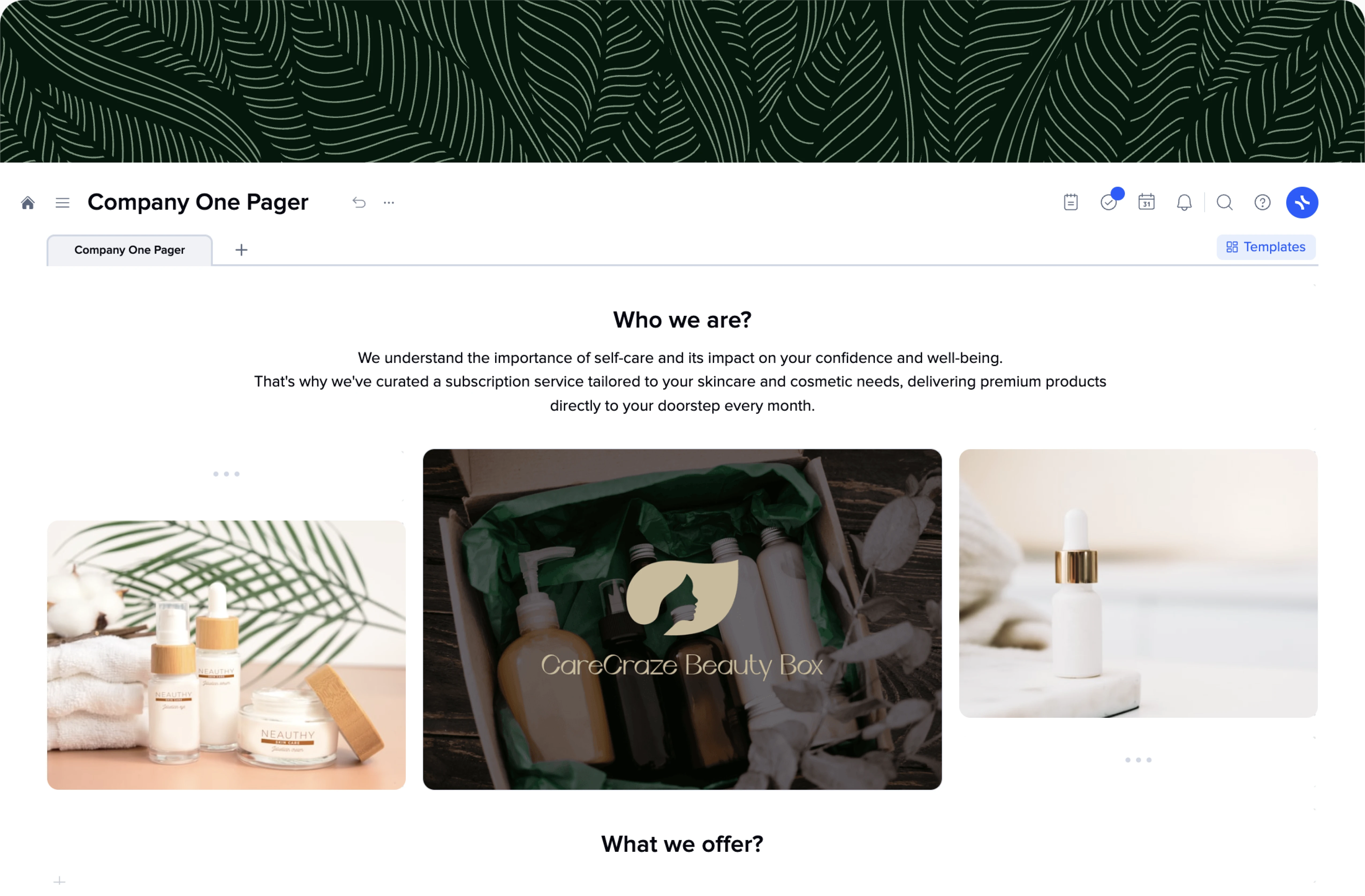
Company One Pager
One Pager Template
There’s a fine line between inspiring people to learn more about what you can offer and discouraging them. How can you put in a couple of sentences everything worthy about your business? Yes, it’s a challenge, but we’re here to help you complete it successfully. Certain rules and principles help to grab people’s attention, so they present us with the most valuable asset they have – time. Then, using the polished structure and refined content to tell them the most important things about ourselves, we can engage our potential audience.
Companies are constantly trying to come up with new methods to be ahead of their competitors and win the fight for people’s attention. However, among all the latest marketing tricks and approaches, few maintain their status quo. These tools have already proved their effectiveness over the last few years, and the latest research shows that it won’t change much over the next few years.
One of them is a one-pager – a document that presents your business in the most concise yet compelling way. Some may think that one page is not enough to tell everything important. However, once you have a clear structure and know what exactly to put into your company’s one-pager, you will see that that’s the perfect size to introduce your business to everyone who may be interested. The modern world is constantly changing, never stopping for too long on something. That’s why one page is the perfect amount of space to contribute everything you find worthy of sharing.
Before we start working on your one-pager using xTiles template, let’s go over what exactly a one-pager is and why neglecting its creation may be a bad decision.
What is a One Pager?
So, what is a one-pager? It’s your company overview, the essence of your company history, goals, beliefs, values, plans, etc. This document’s name speaks for itself. Telling the world about your company, you will be limited to one page. Is it enough? More than you would think. You have enough space to explain why you’re the one, and the potential customer won’t sacrifice too much time learning it. It’s a win-win situation.
Many business owners would like to talk about their companies for hours which is completely understandable. However, that’s not an option when you try to attract someone’s attention. Maybe later, you could go back and forth, but the beginning should be intriguing, amusing, and arousing interest in your company. Then, you will have a chance to go further and present your customer with every detail.
One-pagers rules no one speaks about
There are certain rules regarding how a one-pager should look and what it should contain. And naturally, when creating one, you will find that there are pitfalls we would like to mention too.
- The first rule of a successful one-pager is to make it look easy but give the feeling of how much you have put into it. A well-done job, in this case, a great one-pager, stands out for any company better than anything else. If you can work so devotedly on your one-pager, then you take this approach for everything else.
- One-pagers are the best option to tell the most important things about your company in a visually appealing way. Why is the visual part so important? Because it’s what people estimate in the first place. Although we know that there can’t be a lot of text in one-pager, there still is content people need to consume, which takes a couple of minutes. While colors, designs, elements placement, etc., can be checked in a couple of seconds. Visuality is a convincing factor to look further.
- A successful one-pager is humble but confident. There’s no need to brag about your achievements because that would be the last thing that helps to build credibility.
- Your one-pager is about your audience, their needs, and how your company and its features may help. When you start working on it and through the whole process, try to put yourself in potential readers’ shoes. Would you hastily nod to every sentence?
When do you need a One Pager?
An attention-grabbing one-pager will come in handy for different purposes. The main and foremost is to attract attention to your company and what you do. One-pagers help to pitch potential investors or customers. It’s likely to be the first step for long cooperation. However, the scope of the application may be much wider.
- One-pagers are good for advertising your business, providing people with a clear image of your company in the shortest possible time.
- They work as a guarantee of quality, building your company’s reliability. The fact that someone devoted their time to creating a document that saves time and effort to learn something is appealing.
- Your one-pager is not a one-time action. Although any company tries to evolve and develop, it still will be up-to-date for some time. And next time you need to make a new one-pager or renovate the existing one, you will know what exactly should be there.
- A one-pager may also be a great element of onboarding for new employees or all applicants. It’s good to convey your company’s value not only to potential customers or investors but also to those who want to become team members.
One Pager elements
We understand that there is so much of everything you would like to share. One-pager size might be a challenge. What should be there? What is not so important and can be deleted? These are hard questions. That’s why one-pager templates are so helpful and needed. They spare you the torment of choice, offering you a polished formula of what needs to be said.
Sometimes, people start working on a one-pager by looking for other companies’ one-pagers ideas. It may seem that the internet is full of one-pagers examples. The thing is that each company is different and what suits one is likely to be useless for others. However, research and comparison is always an intelligent decision if only you have enough time.
Creating our example of a one-pager, we checked hundreds of them to come up with the perfect structure. Here’s what we’ve learned about a one-pager that captures attention and holds it till the last word.
You can divide a page into three equal zones. Each of them is hugely important and better not be skipped. It may seem that the top of a one-pager is more significant than the bottom, but it’s not quite true. They simply differ because of the information you put there. If the content is distributed properly, each of them would be attractive and interesting to a reader.
What to put at the top of your one pager?
- Obviously, it’s good to start with your company’s logo. Let them know you and let them know what to expect. It sets the tone for further introduction. You also can share your company’s short story. It will break the ice and let them know and understand you better.
- The logo played its role, and now your pain points have to grab their attention and hold it. Find what your audience specifically needs/wants and give them something they can relate to. In this part, trying to win everyone’s hearts might play a bad joke with your expectations from your one-pager. So, be as specific as possible.
- Finally, give the solution, the climax everyone seeks. Tell your audience that the problem described in the pain points is not a problem at all if you’re in this together.
What to put in the middle of your one pager?
Now you can talk about your business and its features a bit more. The middle part of a one-pager is a good place to tell them why your company is special and how it works. It may be a list of benefits (24/7 service, trained employees, guarantees, advanced techniques and approaches, etc.).
If you think such a list will not speak for itself and might not seem very convincing, you can use a “so what?” trick. Question every benefit and answer, prioritizing your audience’s needs. What does it give to you? You provide the audience with additional facts and avoid misunderstandings, explaining what exactly hides behind each feature you offer.
To conclude everything mentioned above, you can share what benefits the audience will get from your specific features.
What to put at the bottom of your one pager?
Now, let’s inspire your audience to take action and get in touch with you. The last part of our one-pager structure is CTA (call to action) and your contact information.
- CTA should be catchy and relatable but try to avoid using cliches or cheezy phrases from your sphere that everyone is already tired of. So, there are only two options – be simple and true or be creative.
Be very careful with jokes and puns, as they might level out everything you’ve reached with all the previous text.
- Add your phone number and email address and everything you can freely include – your social media, especially. Let it be easy to find and learn more about you.
Optionally, and if there’s enough place, you can share your testimonials. They will work as your advertisement too.
Other tips for creating your best one pager
We’re almost finished. You have our one-pager template, and we reviewed the most important parts and elements. Let’s finish with the last tips that will complement the overall picture.
- Since your one-pager is supposed to present your company, it would be good to have the team members involved. Take many visions of your business and summarize them.
- Sometimes, trying to be serious in their one-pagers, people accidentally cross the line and fall into boredom. Besides presenting the right information, you need to do it the right way – making it easy and appealing.
- You might need more than words to deliver your message. Visual content will be a great addition. Videos, images, GIFs, etc., are far easier to remember than text. However, you should be careful in maintaining the balance. We’ve seen many one-pagers examples where rich media are superior to textual elements making it hard to concentrate on the information.
- Make your pitch document fully responsive. Many users prefer to get information using their phones. And if there’s no mobile version of your one-pager and a person needs to zoom and scroll all the way, it might be a powerful factor to stop.